Responsive Web Design on Multiple Devices
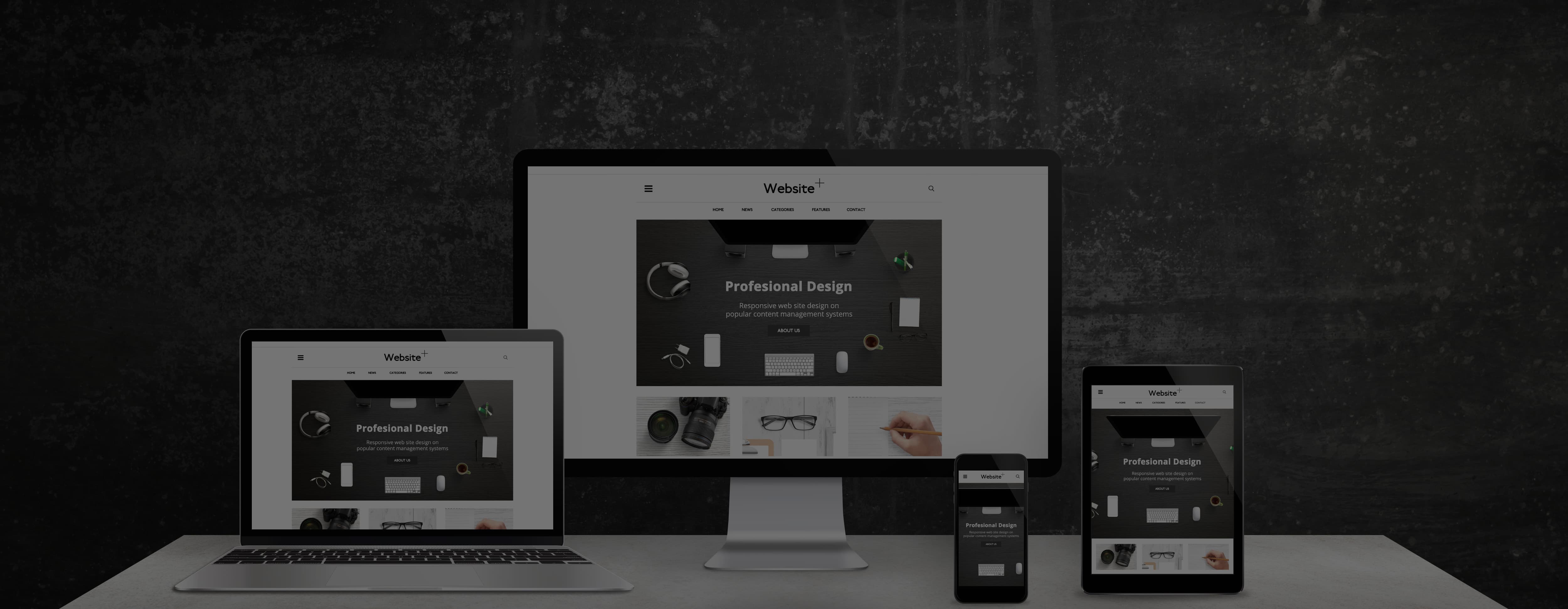
The image features a responsive website displayed on a desktop, laptop, tablet, and smartphone, highlighting adaptable design for different screen sizes.

The image features a responsive website displayed on a desktop, laptop, tablet, and smartphone, highlighting adaptable design for different screen sizes.